Immunology 2011™ – The American Association of Immunologists
Poster Presentation Guidelines
Poster Session Policies
Posters will be on display from Saturday, May 14 through Monday, May 16 in the Exhibit Hall. Authors are welcome and encouraged to put up their posters by 9:30 AM on Saturday, May 14, and leave them up for the duration of the meeting. At a minimum, authors are required to have their posters on display 9:30 AM – 4:30 PM on the day of their presentation.
- Presenters must be at their poster boards from 2:30 PM – 3:30 PM on their assigned day.
- Posters must remain on display until 4:30 PM on the assigned presentation day, but can be left for the duration of the meeting. All posters must be removed by 5:00 PM on Monday, May 16.
- Recording any presentation or session (oral or poster) by any means, (photography, audio taping, and videotaping) is prohibited except by an AAI authorized agent for official purposes or by first authors who want to photograph their own poster presentations.
Poster Presentation Guidelines
Posters should be legible from a distance of five feet away. The message should be clear and comprehensible without oral explanation. The following guidelines have been prepared to help improve the effectiveness of poster communication.
- Initial Sketch - Plan your poster early. Focus your attention on a few key points. Try various styles of data presentation to achieve clarity and simplicity. Does the use of color help? What needs to be expressed in words? Suggest headlines and text topics.
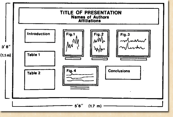
- Rough Layout - Enlarge your best initial sketch, keeping the dimensions in proportion to the final poster (see diagram). Ideally, the rough layout should be full size. A blackboard is a convenient place to work. Print the title and headlines. Indicate text by horizontal lines. Draw rough graphs and tables. This will give you a good idea of proportions and balance. Ask associates for comments. This is still an experimental stage.
- Text Layout - Avoid abbreviations, acronyms, and jargon. Use a consistent font throughout. It is recommended that authors use a 20 pt. font size; this makes the text legible from five feet.
- Final Layout - The artwork is complete and the text and tables are typed, but not necessarily enlarged to full size. Now ask, is the message clear? Do the important points stand out? Is there a balance between words and illustrations? Is there spatial balance? Is the pathway through the poster clear?
- Balance - Figures and tables should cover slightly more than 50% of the poster area. If you have only a few illustrations, enlarge them. Do not omit text, but keep it brief. The poster should be comprehensible without oral explanation.
- Eye Movement - The movement (pathway) of the eye over the poster should be natural, down the columns or along the rows. Size attracts attention. Arrows, pointing hands, numbers, and letters can help clarify the sequence.
- Simplicity - Resist the temptation to overload the poster. More material may mean less communication.
- Bring your own pushpins!!
Sample:

The poster-board surface area is 3'8" high and 5'6" wide. Prepare a 6" high headline strip that runs the full width of the poster. Include the title, authors, and affiliations on the strip in letters not less than 1" high. Post a large-typed copy of your abstract in the upper left-hand corner.
© The American Association of Immunologists, Inc.
9650 Rockville Pike | Bethesda, Maryland 20814 | Phone: (301) 634-7178 | Fax: (301) 634-7887
Email: infoaai@aai.org | Website feedback: AAI Webmaster
